03.23.22
Morion specimen honoured in global design competitions
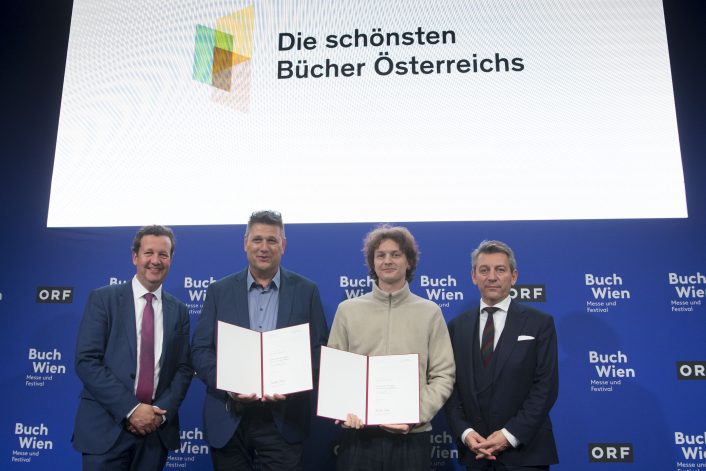
Having won an award as one of the most beautiful books in Austria in 2021, "A Non-Reader for people who like to look at letters" otherwise known as the specimen for Morion typeface by David Einwaller, the book has recieved an Honorary Appreciation from the "Best Book Design from all over the World" competition.
For more than 60 years, the Stiftung Buchkunst has been promoting the exemplary designed utility book and providing it with a highly regarded forum through the competition "Best Book Design from all over the World". The results of these design competitions set landmarks and follow new developments. They serve as impulses for outstanding design and exemplary processing.
The competition "Best Book Design from all over the World" offers the opportunity to observe and record international developments and national differences in book design. Of the submissions from over 30 countries, only 14 works will be awarded by the international jury.
Click here to read the Jury statement.
"A Non-Reader for people who like to look at letters" also won a Bronze award at the DINZ Best Awards in 2021.
As a foundry, producing a printed specimen is a pleasurable addition to a typeface release, bringing a designer's typeface to life in a physical form. We would like to thank David for his commitment and supurb design of the specimen, we hope you feel proud of your achievements. Our role as publishers has kept us busy, sending out hundreds of copies all around the world and fending countless enquires between editions.
For the next edition of the book we are looking to offer the book from third party retailers, this will allow for more people to access the book with faster shipping times and hopefully combat rising production and shipping costs as we will produce more copies. If you think you would be a suitable retailer, please get in touch with us.


